Orthodontic Website Design That Converts
Posted on 5/28/2026 by WEO Media |
How to Build a Site That Books More Consultations
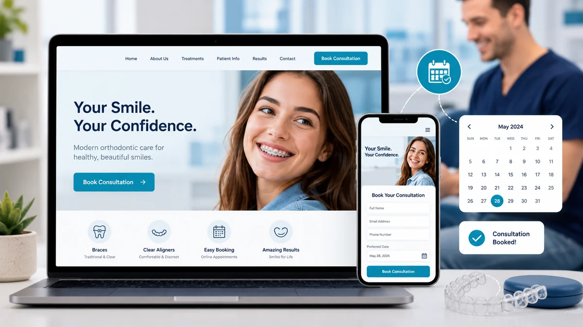 An orthodontic website design that converts books more new patient consultations by answering three questions above the fold—“What do you treat?” “Who is this for?” and “How do I start?”—and removing every avoidable click between a curious visitor and a booked consultation. An orthodontic website design that converts books more new patient consultations by answering three questions above the fold—“What do you treat?” “Who is this for?” and “How do I start?”—and removing every avoidable click between a curious visitor and a booked consultation.
If your traffic looks healthy but your consult requests are flat, the issue usually isn’t the ad campaign or the SEO—it’s the site doing the converting.
The pattern is predictable: parents and adult patients land on an orthodontic homepage, scan for two or three signals (treatments offered, who treats whom, what happens next), and either book a consult or bounce within seconds. Whether visitors arrive from SEO, paid ads, a Google Business Profile click, or a referral, the website determines whether that visit converts. The four most common conversion killers are unclear hero messaging, hidden or generic calls to action, slow or unstable mobile pages, and treatment pages that read like brochures instead of decisions. These are design and content problems, not traffic problems—and they’re fixable.
Already getting good traffic? Keep reading. If traffic is the issue, start with patient acquisition first.
Below, you’ll learn how to audit your current site against the visitor → consult → started-treatment funnel, what an orthodontic-specific homepage should do in the first three seconds, how to write treatment pages that answer real patient questions, and which trust signals actually move the needle for parents choosing between two or three local practices.
Written for: orthodontic practice owners, practice managers, and marketing coordinators who want their website to do more of the converting—so the front desk can focus on starts, not first-time explanations.
TL;DR
If you only do six things, do these:
| 1. |
Make the hero section answer three questions in three seconds - what you treat, who you treat, and how to start
|
| 2. |
Put a sticky consult button on every page - one primary action, visible without scrolling, on mobile and desktop
|
| 3. |
Rebuild treatment pages around decisions, not features - braces vs. clear aligners, kids vs. teens vs. adults, what to expect
|
| 4. |
Speed up mobile and stabilize layout - Largest Contentful Paint under 2.5 seconds, no shifting buttons under thumbs
|
| 5. |
Show local proof above the fold of every treatment page - reviews, before/after counts, doctor credentials, neighborhoods served
|
| 6. |
Reduce the consult form to the minimum viable ask - name, phone or email, preferred contact time, treatment interest |
Table of Contents
The orthodontic website conversion funnel
Before talking about colors, photos, or layouts, get clear on the funnel your website is actually responsible for. For most orthodontic practices, it looks like this: visitor → engaged visitor → consult request → scheduled consult → kept consult → started treatment. Your website’s job is to move visitors through the first three steps. Everything after that is intake, patient experience, and clinical conversion.
The numbers that matter:
| • |
Engaged visit rate - the share of sessions that scroll past the hero and view at least one treatment page (a healthy benchmark for orthodontic sites is roughly 55–70%)
|
| • |
Consult request rate - consult form submissions and phone clicks divided by total sessions (1.5–4% is typical for well-targeted orthodontic traffic)
|
| • |
Page-to-consult rate - of visitors who view a treatment page, what percentage request a consult (a strong treatment page converts 3–6%)
|
| • |
Source-by-source conversion - paid, organic, GBP, and referral traffic each convert differently; one blended number hides the real story |
If your overall consult request rate is under 1%, the issue is almost always the hero, the treatment pages, or mobile experience—not traffic volume. Fix conversion before you spend more on acquisition.
A pattern we commonly see: practices invest heavily in Google Ads to drive clicks, then route every visitor to a homepage that hasn’t been touched in three years. The ad promises “Free Invisalign Consultation,” the landing page shows a stock photo and a navigation menu, and the visitor leaves. The fix isn’t a bigger budget—it’s a treatment-specific landing page experience that matches the ad’s promise.
> Back to Table of Contents
What your homepage hero must do in 3 seconds
The hero section—everything visible before a visitor scrolls—is where most orthodontic sites win or lose the visit. On mobile, that’s roughly the top 600–700 pixels. You have about three seconds to answer three questions clearly:
| 1. |
What do you treat? Braces, clear aligners, early treatment, surgical orthodontics—name them, don’t hide them under a generic “Services” menu
|
| 2. |
Who is this for? Kids, teens, adults, or all three—show it in the photo and say it in the subhead
|
| 3. |
How do I start? One primary action—“Book a Free Consult” or “Schedule Online”—visible without scrolling |
What the hero should contain:
| • |
A specific headline - “Braces and Clear Aligners for Kids, Teens, and Adults in [Neighborhood]” beats “Welcome to Our Practice” every time
|
| • |
A real photo - your team, your office, or a real patient (with permission)—not a stock smile that signals “generic dental practice”
|
| • |
One primary call to action
- “Book a Free Consult” in a high-contrast button, repeated as a sticky element on scroll
|
| • |
One secondary action - “Call 888-246-6906” or “Text Us” for visitors who prefer phone or message
|
| • |
Local trust at a glance - star rating, review count, and city or neighborhood served |
What to remove from the hero: rotating carousels (most users never see slide 2), long paragraphs of welcome copy, generic value propositions like “quality care, exceptional service,” and any CTA that says “Learn More” without specifying what.
A simple test: screenshot your homepage on a phone, blur the image until you can only see shapes and colors, and ask someone outside the practice, “What does this business do and what do they want me to do next?” If they can’t answer in five seconds, the hero needs work.
> Back to Table of Contents
Treatment pages that drive consult requests
Treatment pages are where most orthodontic websites lose conversions. They tend to read like clinical brochures—“Invisalign uses a series of clear, removable aligners”—when what visitors actually want is help making a decision. The patient’s real questions are: Is this right for me or my kid? How long will it take? What does the process look like? Why this practice over the one down the street?
Structure each treatment page around the patient’s decision
A high-converting orthodontic treatment page typically follows this order:
| 1. |
Decision-first headline - “Clear Aligners in [City]: Is Invisalign Right for You?” signals “this page will help me decide,” not “this page will sell to me”
|
| 2. |
Above-the-fold consult CTA - many treatment-page visitors are ready to book on arrival; don’t make them scroll past three sections to find the button
|
| 3. |
Who it’s for - ideal candidates (mild crowding, mature teen, adult professional, etc.) so visitors can self-qualify
|
| 4. |
What to expect - a clear, plain-language walkthrough of consult, records, treatment, and retention—not a clinical specification sheet
|
| 5. |
How long it takes - typical treatment ranges, with honest acknowledgment that individual cases vary
|
| 6. |
Local proof - reviews from patients who chose this treatment at this practice, ideally with first names and neighborhoods
|
| 7. |
Comparison content - braces vs. clear aligners, in-house aligners vs. Invisalign, traditional vs. self-ligating brackets—visitors are already comparing, so help them
|
| 8. |
Final CTA - one primary action, repeated, with a clear next step |
Write for the decision, not the dictionary
Replace generic clinical descriptions with specific, decision-useful language. For example, instead of “Invisalign is a popular orthodontic treatment that uses clear aligners to straighten teeth,” write something like: “Most of our adult Invisalign patients are professionals who want to straighten their teeth without anyone at work noticing. Treatment typically takes 12 to 18 months, with aligners worn 22 hours a day. You’ll come in roughly every 6 to 10 weeks for a quick check.” That paragraph answers four real questions in 50 words.
Match treatment pages to traffic sources
If you run Google Ads for Invisalign, the click should land on a dedicated Invisalign page—not the homepage—and that page should match the ad’s headline, offer, and audience. A search for “braces for kids near me” should land on an early treatment or kids’ braces page, not a generic adult-leaning hero. Message match between ad and landing page is one of the single biggest levers for paid conversion.
> Back to Table of Contents
Trust signals that actually move parents and adults
For orthodontic treatment, trust is the conversion. Treatment is a multi-year, multi-thousand-dollar commitment, and most patients evaluate two or three practices before booking a consult. The trust signals that move the needle are specific, local, and recent.
Trust signals worth featuring prominently:
| • |
Star rating with review count and source - “4.9 stars from 312 Google reviews” carries more weight than a generic “5-star practice” badge
|
| • |
Recent reviews on treatment pages - reviews dated within the last 12 months, mentioning the specific treatment, ideally with a first name and neighborhood
|
| • |
Doctor credentials and bios - board certification, residency, years in practice, and a real photo—orthodontists have specialty training that general dentists don’t, and most parents don’t know that until you tell them
|
| • |
Before-and-after gallery with real patients - own-practice cases (with consent), organized by treatment type and case complexity
|
| • |
Years in the community and neighborhoods served - “Treating families in [neighborhood] since 2008” signals stability
|
| • |
Awards from credible sources - skip the pay-to-play badges; lead with genuine recognition |
Trust signals to handle carefully: testimonial videos work, but only if they sound like real patients, not actors; awards are powerful when verifiable and weak when generic; “As seen on” logos help only if the publications are recognizable to your audience.
Compliance note for reviews: the FTC’s rule on the use of consumer reviews and testimonials, which took effect on October 21, 2024, prohibits fake reviews, undisclosed insider reviews, and review suppression. Practices should not incentivize specific-sentiment reviews or buy fake reviews—civil penalties are substantial. Ask for honest reviews from real patients, and don’t edit or selectively suppress what they say. This protects both your patients and your practice.
> Back to Table of Contents
Mobile, speed, and Core Web Vitals for ortho sites
The majority of orthodontic site traffic now arrives on a phone—often a parent checking between meetings or a teen searching after school. If your site loads slowly, shifts as it renders, or makes buttons hard to tap, you lose conversions before the content has a chance to work.
The three Core Web Vitals that matter
Largest Contentful Paint (LCP): how quickly the biggest above-the-fold element loads. Target under 2.5 seconds. For orthodontic sites, the LCP is usually the hero image—so compress and properly size it, and serve modern formats like WebP.
Interaction to Next Paint (INP): how responsive the page feels when someone taps a button or opens a menu. Target under 200 milliseconds. INP replaced First Input Delay as a Core Web Vital in March 2024, and it’s often where heavy chat widgets, third-party scripts, and analytics tools drag down otherwise fast sites.
Cumulative Layout Shift (CLS): how much the layout jumps as the page loads. Target under 0.1. A common ortho-site failure is a hero image that loads after the headline, pushing the CTA button down just as a visitor tries to tap it.
Mobile-specific essentials
| • |
Tap targets at least 48×48 pixels - per Lighthouse’s mobile accessibility guidance, smaller buttons cause mis-taps and frustration
|
| • |
One primary CTA visible without scrolling - typically a sticky “Book a Consult” button anchored to the bottom of the viewport
|
| • |
Click-to-call on the phone number - the phone number should be a tappable link, not an image of a number
|
| • |
Forms that work with mobile keyboards - input types set correctly (tel, email) so phones surface the right keyboard
|
| • |
No intrusive interstitials - pop-ups that cover most of the screen on mobile can hurt rankings and conversion both |
> Back to Table of Contents
Consult forms, scheduling, and the “easy yes”
The consult form is the most important conversion element on the site. Most orthodontic forms ask for too much, too soon—and lose patients who would have booked if the form had been shorter.
The minimum viable consult form
For a first-touch consult request, four fields is usually enough:
| 1. |
Name - first and last in one field, not two
|
| 2. |
Phone or email - let the visitor choose; require at least one
|
| 3. |
Preferred contact time - morning, afternoon, evening, or anytime
|
| 4. |
Treatment interest - dropdown with the three or four treatments you offer |
That’s it. Birth date, insurance, address, dental history—none of that belongs on the consult request form. Collect it at intake or during the consult itself, when the patient has already committed.
Add online scheduling where it fits
For practices ready to take the next step, online scheduling can lift consult-request-to-scheduled rate substantially by removing the “we’ll call you back” gap. The trade-off: scheduling tools require commitment to the booking permissions and visit types, and they shift work from the phone to the back end. For more on this trade-off, see online scheduling for dental practices.
Set expectations for what happens next
The page that appears after form submission—the thank-you page—is often an afterthought. It shouldn’t be. A good thank-you page:
| • |
Confirms the request was received - reduces “did it go through?” anxiety
|
| • |
Sets a clear expectation - “We’ll call you within one business day during open hours”
|
| • |
Offers a faster path - phone number, text option, or live scheduling link for visitors who don’t want to wait
|
| • |
Sends a conversion event
- so paid campaigns, GA4 key events, and call tracking record the conversion accurately |
> Back to Table of Contents
Local SEO and content structure that supports conversion
Conversion design and local SEO are usually treated as separate disciplines. They shouldn’t be. The same elements that help an orthodontic site rank also help it convert—clear treatment pages, real reviews, neighborhood-specific content, fast mobile performance, and accurate business information.
The foundation for orthodontic local SEO:
| • |
A treatment page for each major offering - braces, clear aligners (or Invisalign specifically), early treatment, retainers, and any specialty services
|
| • |
Location pages for each office - if you have more than one office, each needs its own page with unique content, photos, hours, and embedded map
|
| • |
A properly optimized Google Business Profile
- accurate category (Orthodontist), service list, photos, hours, and active review management
|
| • |
Consistent NAP - name, address, and phone identical across the website, GBP, and citations
|
| • |
Schema markup on key pages - LocalBusiness or Dentist schema on the homepage and location pages, FAQPage schema on pages with FAQ blocks, MedicalProcedure schema where appropriate |
Content that supports both SEO and conversion: blog posts that answer real patient questions ("How long do braces take for adults?" "Is my child ready for an orthodontic consult?"), neighborhood guides that show local connection, and team or doctor pages that build E-E-A-T signals. For more on content strategy, see our guide to content clusters for dental SEO and our dental SEO services.
A note on AI Overviews: Google’s AI Overviews have been less prevalent for local healthcare queries since late 2025, so don’t structure your entire content strategy around them. The same content that earns featured snippets, voice search results, and direct answers—clear definitions, scannable structure, FAQ schema—still earns visibility across surfaces.
> Back to Table of Contents
How to measure orthodontic website performance
If you can’t measure it, you can’t improve it—and most orthodontic practices don’t measure their website performance carefully enough to make good decisions.
The metrics that matter most:
| 1. |
Consult requests by source - paid, organic, direct, referral, and GBP—tracked as GA4 key events (renamed from “conversion events” in March 2024)
|
| 2. |
Cost per consult request - by source and by treatment, so you know which campaigns and channels actually produce starts
|
| 3. |
Engagement rate on treatment pages - sessions that scroll past 50% and spend at least 30 seconds—a proxy for content quality
|
| 4. |
Mobile vs. desktop conversion rate - if mobile is dramatically lower, mobile experience is the problem
|
| 5. |
Bounce-then-return rate - visitors who leave and come back are evaluating multiple practices; how often you win the return visit matters |
The reporting cadence we typically recommend: a weekly 15-minute look at consult requests, source mix, and any campaign-level changes; a monthly deeper review of treatment-page performance, mobile metrics, and Core Web Vitals; a quarterly review of redesign opportunities, treatment-page rewrites, and structural changes.
What to ignore: vanity metrics like total pageviews, generic “bounce rate” without context, and rankings without conversion data. A page that ranks #1 but doesn’t convert is a content problem, not an SEO win.
> Back to Table of Contents
When to redesign vs. when to optimize
Not every site needs a full redesign. Sometimes the right answer is targeted optimization—rewriting the hero, restructuring the treatment pages, fixing mobile performance—and sometimes the site has too many structural problems to fix piece by piece.
Signals that targeted optimization is enough
| • |
The site is under three or four years old and built on a current platform
|
| • |
Mobile and desktop performance are within acceptable Core Web Vitals ranges
|
| • |
The structure is sound - clear treatment pages exist, navigation is logical, location pages are in place
|
| • |
The brand looks current - photos, fonts, and colors don’t scream “2014”
|
| • |
The CMS allows the changes you need - hero rewrites, new CTAs, schema additions, form changes |
In these cases, focus on the highest-leverage fixes: hero, treatment pages, mobile speed, and form. You can often double consult request rate without touching the underlying design system.
Signals that a full redesign is the right move
| • |
The site is five or more years old and the platform is outdated or unsupported
|
| • |
Core Web Vitals are failing across most pages and can’t be fixed without rebuilding
|
| • |
Treatment pages don’t exist or are buried under generic “Services” menus
|
| • |
The site doesn’t reflect current treatments or technology you offer
|
| • |
Editing requires a developer for every change - the team can’t maintain the site itself
|
| • |
Multiple offices have been added since the original build and the architecture doesn’t support them |
A redesign timeline to plan for: a thoughtful orthodontic website redesign typically takes 12 to 20 weeks from kickoff to launch, depending on photography, content scope, and treatment-page count. Budget for ongoing optimization after launch—the first 90 days post-launch is when most performance issues surface.
A note on transitions: redirect every URL from the old site to the closest match on the new site, preserve content from pages that already rank, and re-verify your Google Business Profile address and links. Most post-redesign traffic drops are caused by lost redirects, not by Google penalizing the new design.
> Back to Table of Contents
Get help with your orthodontic website
At WEO Media - Dental Marketing, we’ve designed and optimized orthodontic websites for practices across the country—single-doctor offices, multi-location groups, and specialty-focused practices. We focus on the full funnel: visitor → consult → started treatment—not just traffic or design awards.
If your orthodontic website isn’t converting the way it should—or if you’re planning a redesign and want to start with conversion in mind—we’d be glad to take a look. Call 888-246-6906 or request a website audit through our contact page and we’ll walk through your current performance with you.
> Back to Table of Contents
FAQs
What is a good conversion rate for an orthodontic website?
A consult request rate of 1.5 to 4 percent of total sessions is typical for well-targeted orthodontic traffic. Treatment pages should convert visitors at 3 to 6 percent. Rates vary by traffic source, geographic market, and competition, so the most useful benchmark is your own trend over time and a source-by-source breakdown rather than a single blended number.
How many pages should an orthodontic website have?
Most orthodontic sites need a homepage, an about and team page, a dedicated page for each major treatment (braces, clear aligners, early treatment, retainers), a location page for each office, a new patient page, a contact page, and an active blog. That typically totals 12 to 20 core pages, plus blog content. More important than page count is whether each page has a clear job in the conversion funnel.
Should orthodontic websites include pricing?
Most orthodontic practices choose not to publish specific treatment prices because cases vary widely by complexity, insurance, and payment plan. A reasonable middle path is to describe how cost works (typical ranges for orthodontic care, what factors affect cost, financing options, insurance handling) without listing exact figures. The goal is to acknowledge cost as a real concern without overpromising or underquoting.
How long does an orthodontic website redesign take?
A thoughtful orthodontic website redesign typically takes 12 to 20 weeks from kickoff to launch. Timeline depends on photography schedules, content scope, treatment-page count, number of office locations, and how quickly the practice can review and approve work. Budget for ongoing optimization in the first 90 days after launch, when most performance issues surface and the team has fresh data to act on.
How important is mobile design for orthodontic websites?
Mobile is the primary experience for most orthodontic site visitors. Google uses mobile-first indexing, parents commonly research practices on phones between other tasks, and teens almost always arrive on mobile. A mobile experience that loads slowly, shifts as it renders, or hides the consult CTA below the fold will lose conversions regardless of how strong the desktop version looks.
Should we use a chatbot on our orthodontic website?
Chat can help when staffed responsively and configured to answer common patient questions, but it can hurt conversion when it’s slow, generic, or replaces a clearer primary CTA. The decision should start with whether chat genuinely improves response time and patient experience compared with the existing phone, form, and text channels—not with whether the widget is available. Heavy chat scripts can also slow mobile performance, which has its own conversion cost.
What is the most common mistake on orthodontic websites?
The most common mistake is treating the homepage hero as decorative rather than functional. Generic welcome copy, rotating carousels, stock photos, and vague calls to action like “Learn More” leave visitors without a clear answer to what the practice treats, who it’s for, and how to start. A specific headline, real photo, named treatments, and a single primary CTA address all three questions in the first three seconds.
How does orthodontic website design affect SEO?
Design and SEO overlap more than they’re usually treated. Core Web Vitals (LCP, INP, CLS) are ranking signals tied directly to design and development choices. Clear treatment-page structure helps both ranking and conversion. Mobile usability affects rankings and conversion. Schema markup supports rich results. A well-designed site is usually a well-optimized site, and vice versa—treating them as separate projects often produces weaker results in both. |
|